
A simple guide for junior designers about common UI/UX portfolio mistakes, from weak case studies to too many screens without clear thinking.
A UI/UX portfolio is not only a place to show nice screens.
It is the place where people try to understand how you think.
This is especially important for junior designers. You may not have many real projects yet. That is normal. But your portfolio can still show your process, your decisions, and your learning.
I see many junior portfolios with the same problem:
The visual work looks good, but the story is weak.
So in this post, I want to share the common UI/UX portfolio mistakes junior designers should avoid.
1. Showing only final screens
This is the most common mistake.
Many junior designers show only polished screens. The UI may look clean, but I cannot see the thinking behind it.
Why did you choose this layout?
What was the problem?
Who is the user?
What did you try before this final version?
If your portfolio only shows the final result, it looks more like a gallery. A UI/UX portfolio needs more than a gallery.
Show a little bit of your process. You do not need to show everything. But show enough to make your decision clear.
2. Writing a case study with no real problem
A case study should start with a problem.
Not with a big hero image.
Not with five app screens.
Start with the reason behind the project.
For example:
- Users had trouble finishing the checkout flow.
- The onboarding was too long.
- The mobile form had too many steps.
- The dashboard was hard to scan.
When the problem is clear, the design decisions become easier to understand.
If the problem is not clear, the reader only sees decoration.
3. Making every project look the same
This one is small but important.
Some portfolios have three or four projects, but all of them look like the same SaaS dashboard or the same mobile app.
I understand why this happens. Designers follow trends. They use similar cards, gradients, icons, and layouts.
But your portfolio should show range.
You can show different types of work:
- A mobile app flow
- A web dashboard
- A landing page
- A redesign case study
- A small design system
You do not need ten projects. Three strong projects can be enough.
But each project should teach something different about you.
4. Ignoring UX and only showing UI
UI quality matters. Spacing, type, color, contrast, and component consistency are important.
But if you call it a UI/UX portfolio, you should also show some UX thinking.
This does not mean you need a huge research report.
For a junior designer, simple UX thinking is enough:
- Who is using this product?
- What is the main user goal?
- Where can the user get confused?
- What happens if there is an error?
- What is the main action on this screen?
These questions make your work stronger.
They also show that you are not designing only for Dribbble. You are designing for use.
5. Not explaining your role
If a project was a team project, say what you did.
If it was a school project, say it.
If it was a concept project, say it.
This is not a bad thing. It is honest.
The mistake is making every project look like a real client project when it was not.
People do not expect junior designers to have ten big shipped products. But they expect clarity.
A simple role section helps:
- Role: UI/UX designer
- Scope: user flow, wireframe, UI design, prototype
- Tools: Figma, FigJam
- Timeline: 2 weeks
This makes the project easier to read.
6. Too much text, but not enough meaning
Some case studies are very long, but still say very little.
Long text is not always good.
The reader wants to understand your process quickly.
Use short sections. Use clear headings. Show the decision, then show the screen.
A better structure can be this:
- Project summary
- Problem
- User goal
- Flow or wireframe
- UI direction
- Key decisions
- Final screens
- What I learned
This is simple. But simple is good.
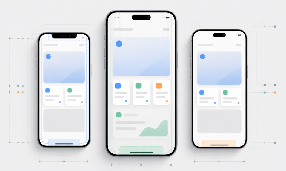
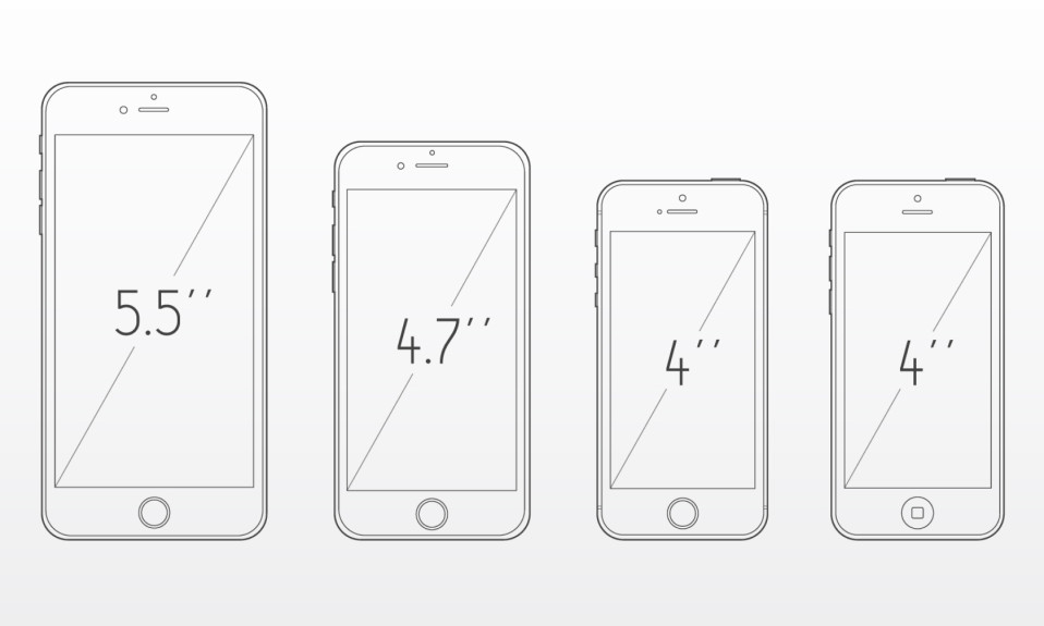
7. No mobile or responsive thinking
Many portfolios show only big desktop mockups.
But real products live in many screen sizes.
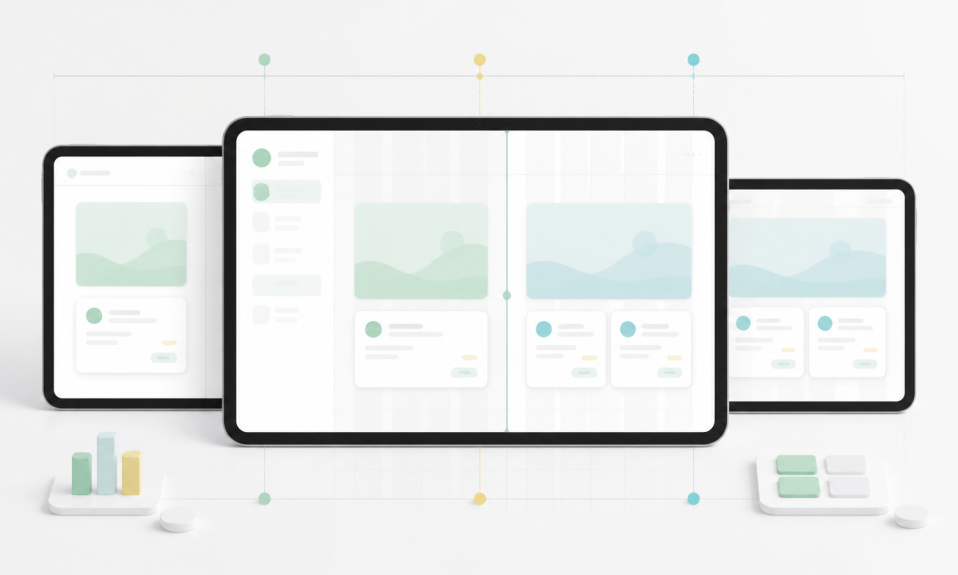
If the project is mobile, show mobile clearly. If it is web, show how the layout changes or at least explain your responsive thinking.
Screen size is not a small detail. It changes hierarchy, spacing, content, navigation, and interaction.
I wrote a separate guide about this here: Mobile Screen Sizes for UI Design.
If you design in Turkish market or want a Turkish reference, you can also check this older but updated guide: Mobil Arayüz Tasarımı Ekran Boyutları Nedir?.
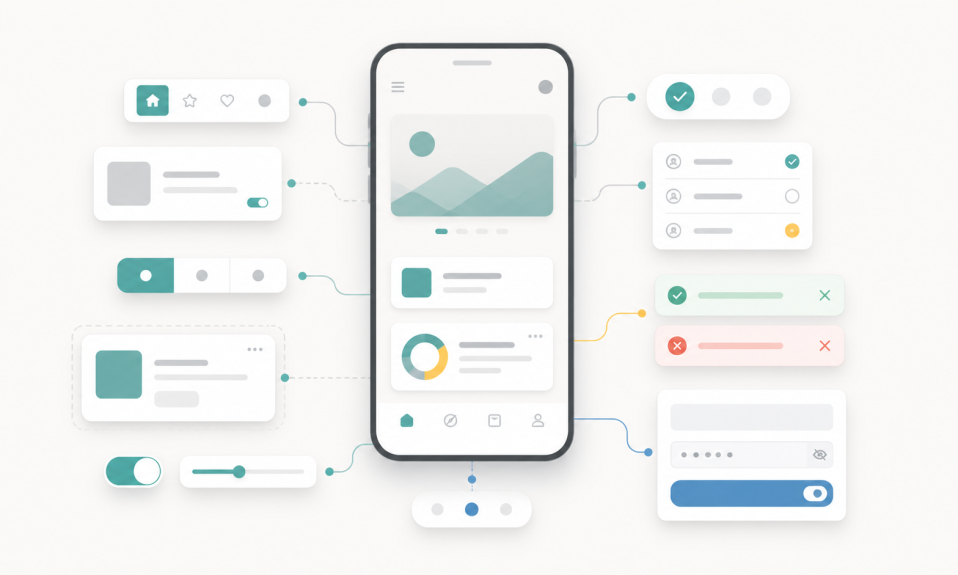
8. Weak visual consistency
Portfolio design is also a design problem.
If your portfolio page has weak spacing, random typography, and different button styles, it hurts your work.
Before people read your case study, they already feel your design quality from the page itself.
You do not need a complicated website.
A clean layout is enough:
- Readable type
- Good spacing
- Clear project cards
- Fast loading images
- Simple navigation
- Easy contact link
Your portfolio should help the project, not fight with it.
9. Hiding the messy part
Junior designers sometimes try to make everything look perfect.
But design is not perfect from the first try.
It is useful to show a small part of the messy process:
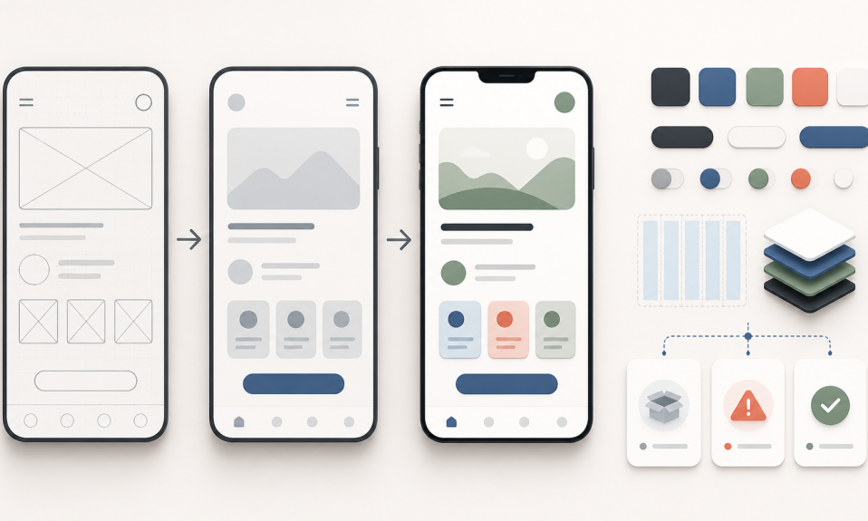
- Early wireframes
- Rejected ideas
- A problem you noticed late
- A decision you changed
- What you would improve next
This makes the case study more real.
It also shows that you can learn.
10. Not having a clear next step
Your portfolio should make the next step easy.
If someone likes your work, what should they do?
Contact you?
Open your LinkedIn?
Download your CV?
Send an email?
Do not hide this. Add a simple contact area. Make sure links work. Keep the writing short and direct.
A simple checklist for junior portfolios
Before publishing your portfolio, ask yourself:
- Can someone understand the project in 30 seconds?
- Is the problem clear?
- Did I explain my role?
- Did I show at least a small part of the process?
- Are my UI screens consistent?
- Did I explain important decisions?
- Is the page easy to read on mobile?
- Is there a clear contact link?
If the answer is yes, your portfolio is already stronger than many beginner portfolios.
My takeaway
A junior UI/UX portfolio does not need to look like a senior designer portfolio.
It needs to be clear, honest, and useful.
Show your best work, but also show your thinking.
Do not try to look bigger than you are. Try to look clear about what you can do and how you learn.
That is more valuable.
If you are just starting your design career, I also wrote a Turkish guide here: Yeni Mezunlar İçin UI/UX Kariyer Rehberi.
You can also follow more notes in my UI/UX, Product Design, and Growth categories.
Source Signals
- Nielsen Norman Group – 5 Steps to Creating a UX-Design Portfolio
- Nielsen Norman Group – Creating a UX Design Portfolio Case Study
- Interaction Design Foundation – What Should a UX Design Portfolio Contain?
- Interaction Design Foundation – How to Become a UX Designer?
- CareerFoundry – UX Portfolio Mistakes