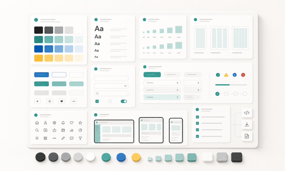
A simple beginner guide to design systems for UI/UX designers. Learn tokens, typography, spacing, components, states, responsive rules, and handoff basics.
A design system can sound like a big topic.
When you are a beginner UI/UX designer, it may feel like something only large product teams need.
But I do not see it like that.
A design system starts with a simple idea:
Do not solve the same design problem again and again.
If you use the same button style, same spacing logic, same color rules, and same form behavior, your product becomes more consistent. Your design file becomes easier to understand. Developers can build faster. Users also feel less confused.
So this is a simple beginner guide to design systems.
What is a design system?
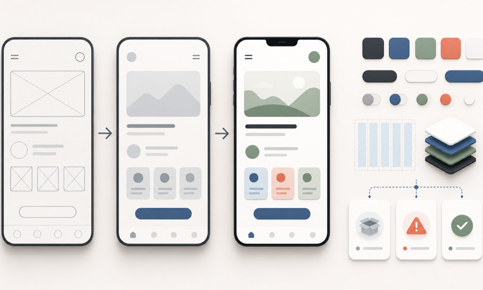
A design system is a shared set of rules, components, and decisions for a product.
It can include:
- Color tokens
- Typography styles
- Spacing rules
- Grid rules
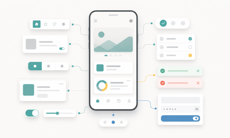
- Buttons
- Form fields
- Cards
- Icons
- Component states
- Responsive behavior
- Usage guidelines
But a design system is not only a Figma file.
It is also a way of thinking.
It helps the team answer this question:
How do we design and build the same product language everywhere?
Component library is not the full system
Many beginner designers think a design system means a component library.
Components are important, yes.
But a component library is only one part of the system.
A real design system also explains why and when to use those components.
For example, having three button styles is not enough. You also need to know:
- Which button is primary?
- When should we use a secondary button?
- What happens when the button is disabled?
- What does the loading state look like?
- How much space should be around the button?
Without these rules, the team still makes random decisions.
Start with design tokens
Design tokens are the small decisions behind the interface.
They are things like color, font size, radius, shadow, and spacing.
For a beginner, you do not need to make this complicated.
Start with a small token set:
- Primary color
- Text color
- Background color
- Error color
- Success color
- Base spacing values
- Border radius
- Main typography sizes
This already makes your design more controlled.
If every screen uses random colors and random spacing, the product starts to feel broken.
Typography is part of the system
Typography is not only about choosing a nice font.
It is about hierarchy.
A user should quickly understand what is important, what is secondary, and what action they need to take.
For a beginner design system, define a simple type scale:
- Page title
- Section title
- Body text
- Small text
- Button text
- Caption or helper text
Keep it simple.
You do not need 20 text styles. A small, clean set is easier to use.
Spacing is where many designs break
Spacing is one of the biggest differences between an amateur screen and a professional screen.
If spacing is random, the interface feels noisy.
Use a basic spacing scale. For example:
- 4
- 8
- 12
- 16
- 24
- 32
- 48
You do not need to use these exact values. The important thing is to have a rule.
When spacing follows a rule, screens become easier to scan. Components also become easier to reuse.
Components need states
A button is not only a rectangle with text.
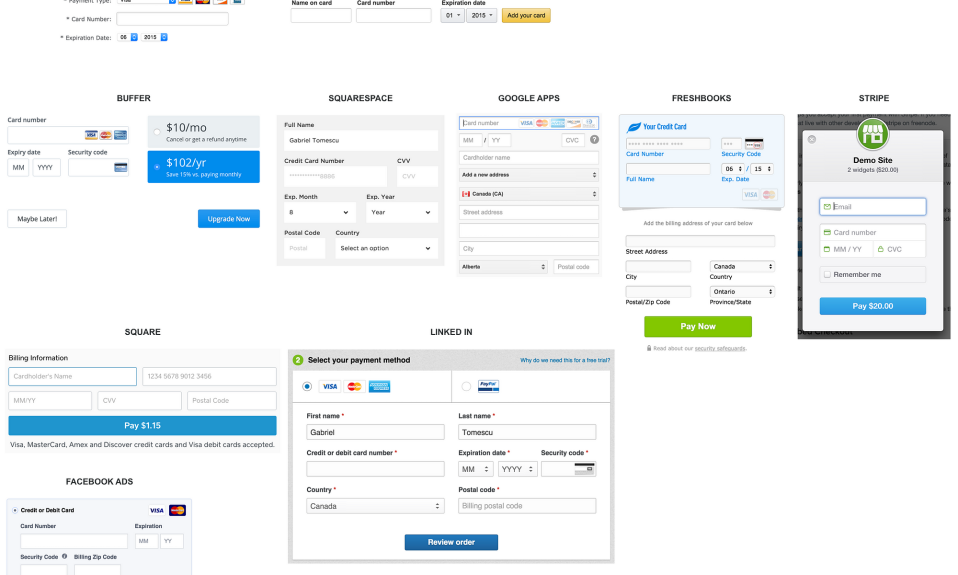
A form field is not only an empty input.
Every component can have states.
For example, a button may have:
- Default
- Hover
- Pressed
- Disabled
- Loading
A form field may have:
- Empty
- Focused
- Filled
- Error
- Success
- Disabled
This is very important for real product design.
If you only design the perfect state, the product will fail when something goes wrong.
Think about responsive behavior early
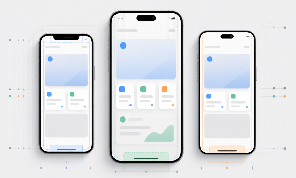
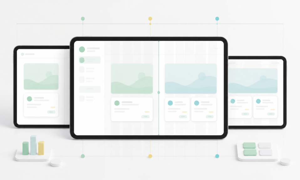
A design system should not live only on one desktop size.
Products are used on different screens.
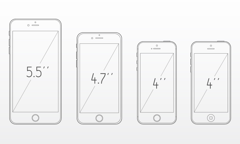
Mobile, tablet, small laptop, large desktop. Each one can change layout decisions.
So when you build a design system, think about responsive behavior early.
Ask simple questions:
- How does this card shrink on mobile?
- Does this table need another mobile pattern?
- What happens to navigation on small screens?
- Can this component work inside a narrow layout?
I wrote a separate guide about this topic here: Mobile Screen Sizes for UI Design.
Accessibility should not be a late fix
Accessibility is also part of a design system.
Color contrast, readable text size, focus states, error messages, and touch targets are not small details.
If you define these rules early, you prevent many problems later.
For example:
- Do not use low contrast text for important content.
- Make touch targets large enough.
- Show clear error messages.
- Do not explain errors only with color.
- Make focus states visible.
A design system should help users, not only designers.
Handoff is part of the system too
A beginner designer may think the design system ends in Figma.
But a product does not end in Figma.
Developers need to build it.
So your system should make handoff easier.
Use clear component names. Keep layers clean. Define spacing. Show states. Explain responsive rules.
This makes the design more useful for the team.
I also wrote about this idea in Turkish here: UI/UX Tasarımcı Olmak İçin Figma Bilmek Yeterli mi?.
A simple design system starter checklist
If you are a beginner, you can start with this checklist:
- Define main colors
- Define typography styles
- Define spacing scale
- Define radius and shadows
- Create button components
- Create form field components
- Create card/list components
- Add component states
- Test mobile behavior
- Write short usage notes
This is enough for a first version.
Do not try to build a giant system from day one.
Start small. Use it in real screens. Then improve it.
My takeaway
A design system is not about making a beautiful component page.
It is about creating consistency.
It helps designers make better decisions. It helps developers build faster. It helps users understand the product easier.
For beginners, the goal is not to create a perfect system.
The goal is to understand the logic.
Start with tokens. Add typography. Add spacing. Build basic components. Add states. Think responsive. Write simple rules.
That is a strong start.
If you are also working on your portfolio, this article may help: UI/UX Portfolio Mistakes Junior Designers Should Avoid.
You can find more related posts in my UI/UX, Product Design, Tools, and Growth categories.