
A practical responsive UI design guide for mobile, tablet, and desktop screen sizes, covering breakpoints, viewport logic, grid, navigation, cards, touch targets, and content priority.
Responsive UI design is not only about making a screen smaller or bigger.
That is the first mistake.
A mobile screen, a tablet screen, and a desktop screen do not need the same layout with different sizes.
They need the same product idea, but with different layout decisions.
So when I think about responsive design, I do not start with “how can I scale this screen?”
I start with a better question:
What should stay, what should move, and what should change at this screen size?
Screen size is not the full story
Screen size matters, but it is not enough by itself.
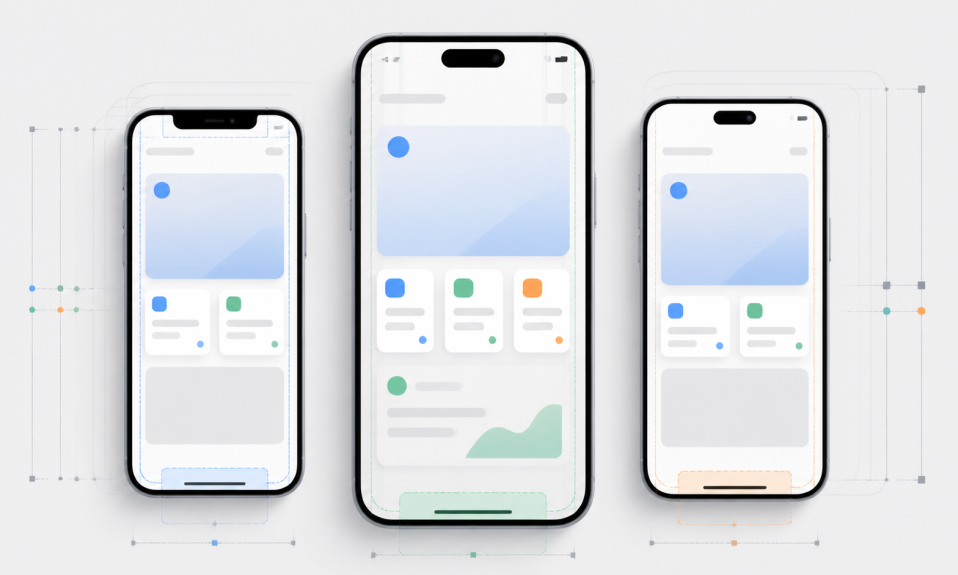
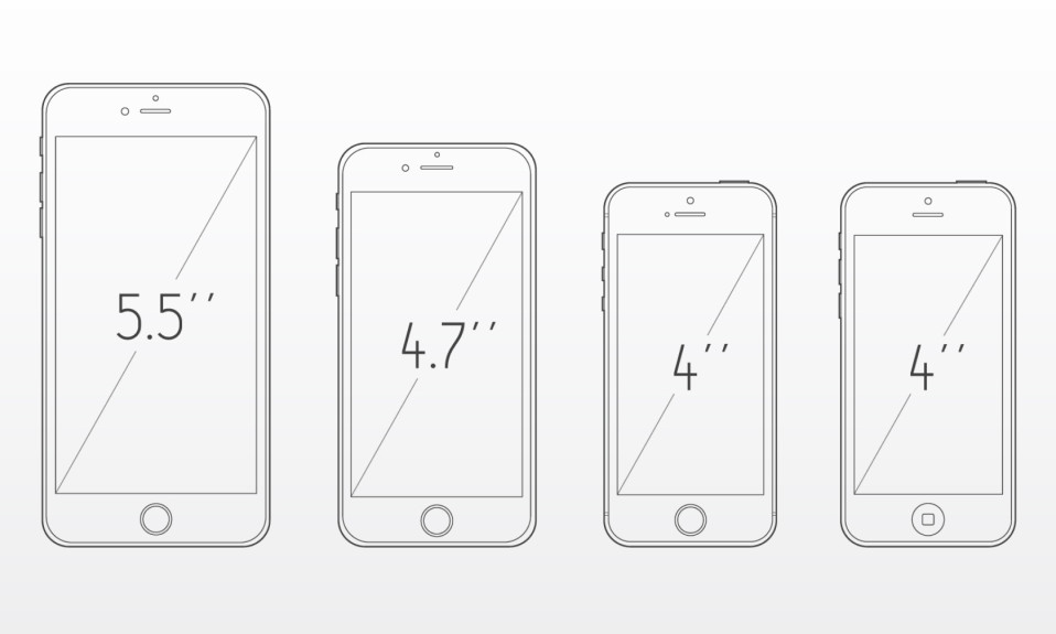
Device resolution, browser viewport, safe areas, navigation bars, zoom level, keyboard, and operating system UI can all change the real space you have.
This is why I do not design only for one device size.
A single iPhone artboard can be a good starting point. But it should not be the whole responsive strategy.
I wrote a separate practical guide about mobile sizes here: Mobile Screen Sizes for UI Design.
The Turkish version is here too: Mobil Arayüz Tasarımı Ekran Boyutları Nedir?.
Think in ranges, not only devices
Designers often ask for exact sizes.
Which iPhone size?
Which iPad size?
Which desktop width?
These are useful questions, but responsive design works better with ranges.
For example, you can think like this:
- Mobile: narrow layout, one column, touch-first actions
- Tablet: more horizontal space, possible split layout, still touch-first
- Desktop: wider canvas, multi-column layout, mouse and keyboard support
This helps you avoid designing one fixed screen and hoping it works everywhere.
Mobile: focus and priority
Mobile UI design is about focus.
There is not much room.
So every section needs a reason to be there.
On mobile, I usually ask:
- What is the main user action?
- What content must be visible first?
- Can this card become simpler?
- Does the user need this secondary information now?
- Is the touch target large enough?
Mobile is not the place to show everything.
It is the place to show the right thing first.
Tablet: do not treat it like a large phone
Tablet design is often ignored.
Many products simply stretch the mobile layout.
This usually feels weak.
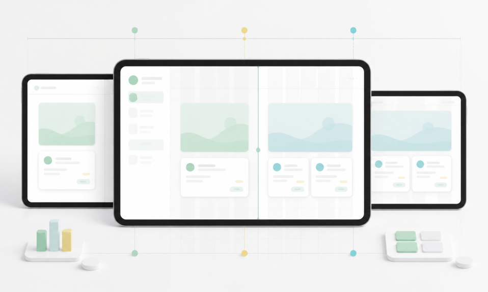
A tablet has more space than a phone, but it is still touch-based. This makes it different from desktop.
On tablet, you can use:
- Two-column layouts
- Side panels
- Master-detail patterns
- Larger cards
- More visible navigation
- More comfortable reading areas
But you should not fill every empty area just because space exists.
Tablet UI needs balance.
Desktop: more space can create more noise
Desktop gives you more room.
But more room does not automatically make the design better.
It can also create more noise.
On desktop, designers often add too many panels, too many cards, too many filters, and too many secondary actions.
The layout becomes powerful but hard to scan.
For desktop UI, I usually think about:
- Clear grid structure
- Readable content width
- Useful sidebars
- Good table behavior
- Hover and focus states
- Keyboard-friendly flows
Desktop should use space with purpose.
Common breakpoint thinking
You do not need to memorize every breakpoint.
But you should understand the logic.
A simple responsive system can start like this:
- Small mobile: around 320-375 px wide
- Modern mobile: around 390-430 px wide
- Tablet portrait: around 744-834 px wide
- Tablet landscape / small desktop: around 1024-1194 px wide
- Desktop: 1280 px and above
These are not strict laws.
They are starting points for design checks.
The real goal is to see where your layout breaks.
Cards should not only stretch
Cards are one of the first things that break in responsive design.
A card that works well on mobile may look too wide on desktop.
A desktop card grid may become too dense on mobile.
So cards need responsive rules.
For example:
- Mobile: one card per row
- Tablet: two cards per row
- Desktop: three or four cards per row
- Large desktop: keep max width instead of stretching forever
The important thing is not the number.
The important thing is readability.
Navigation changes with screen size
Navigation is another big responsive decision.
Mobile may need a bottom tab bar, hamburger menu, or simple top action.
Tablet can sometimes support side navigation.
Desktop can use sidebar, top navigation, or both, depending on the product.
Do not force the same navigation everywhere.
The navigation should match the screen, the task, and the product depth.
Touch targets matter more than visual size
On mobile and tablet, the user touches the screen.
This changes the design.
A button can look fine visually but still be hard to tap.
Small icons, dense table rows, tiny close buttons, and tight filter chips can create friction.
Responsive design should check interaction size, not only visual layout.
This is one reason tablet design deserves more attention.
Content priority is the real responsive work
The hardest part of responsive design is not resizing components.
The hardest part is deciding content priority.
What should stay visible on mobile?
What can move into a secondary screen?
What should become a collapsed section?
What should turn into a tab, drawer, or filter panel?
Responsive design is full of these product decisions.
This is also why a good design system helps. I wrote about that here: Design Systems for Beginners.
My practical responsive checklist
Before I call a UI responsive, I like to check these:
- Does the layout work on narrow mobile?
- Does the main action stay clear?
- Are touch targets comfortable?
- Does tablet use space better than mobile?
- Does desktop avoid becoming too noisy?
- Do cards have max width or grid rules?
- Does navigation change when needed?
- Are empty, loading, and error states considered?
- Does the component system support these sizes?
This checklist is simple, but it catches many problems early.
Final note
Responsive UI design is not a technical afterthought.
It is part of product design.
A good responsive layout understands the device, but it also understands the user task.
Mobile needs focus.
Tablet needs balance.
Desktop needs structure.
If you design with that mindset, screen sizes become less scary.
They become design constraints you can work with.
For more related posts, check my UI/UX, Product Design, Technology, Tools, and Growth categories.